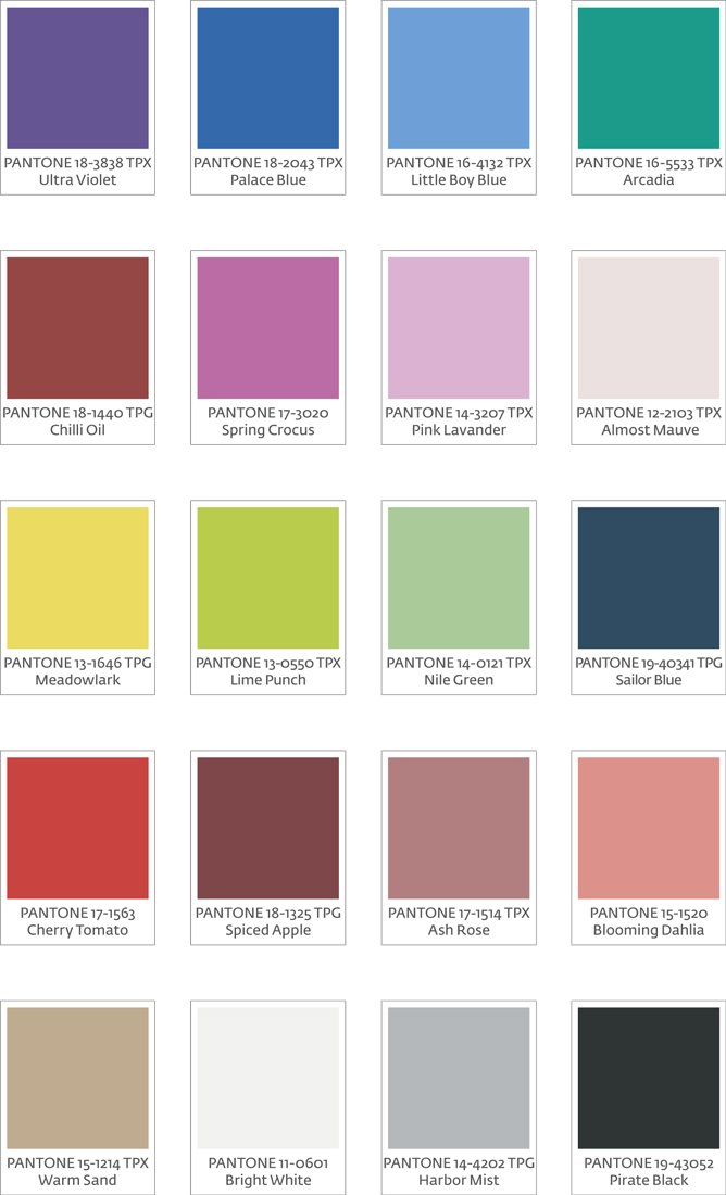


For next season, a series of soft and neutral tones will share preferences with colors that radiate luminosity, harmony and energy.
One of the most prominent colors by PANTONE was ultraviolet, related to cosmo and elegance, followed by Spring Crocus, a very intense pink fuchsia.
The pink line has a lot of credit to succeed, especially in its pastel versions, such as Pink Lavander and Almost Mauve, very soft and close to white.
Within the warm shades appears orange, but very lowered, which is close to an exquisite peach: Blooming Dahlia.
With a greater intensity degree, one of the most proposed is the Cherry Tomato red, with a strong presence and vitality. From the same origin, dark reddish versions appear with brown dyes, which are expressed in the Chili Oil of great personality, which is complemented with another brown of maximum purity such as Emperor chocolate.
The yellows will also have their place through the intense Meadowlark, and lime tones close to green, like the almost fluorescent Lime Punch.
In cold tones, the Arcadia green, a version of the Emerald, and the Little Boy Blue, a pastel and delicate light blue, typical of the “Baby Blue” concept stand out.
The experts report includes five classic essential colors that transcend the seasons, and can be used independently or combined. They are: navy blue, dove gray, warm sand, bone white and pirate black.